Monitoring your broadcast statistics is essential for evaluating the effectiveness of your email campaigns. By analyzing metrics such as open rates, click-through rates, and subscriber engagement, you can refine your content, improve deliverability, and enhance overall campaign performance.
Accessing QuickStats for a broadcast
Note: This feature is not accessible on the AWeber Free plan. Upgrade your account to unlock these features and many more.
Further instructions: How do I upgrade my AWeber account from Free to Plus?
To view detailed statistics for a specific broadcast:
-
Navigate to the Messages tab.
-
Locate the sent message you wish to analyze.
-
Click on the subject line of the message to open its QuickStats page.
Performance Graphs
The next area of the page consists of a large graph which can display different information about your broadcast. To change what data is shown, click the desired tab above the graph.
Domains
The Domains tab in Quickstats is the default view when opening broadcast statistics. It is broken into two sections: a pie chart at the top and a domain performance strip chart below.
Top Section: Domain Performance Scatter Plot
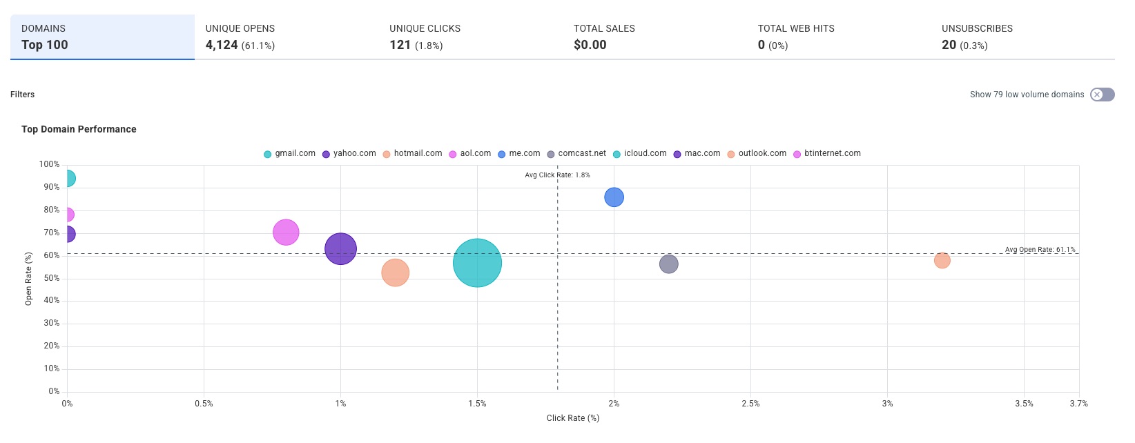
The scatter plot shows how your top recipient domains compare to each other on a single chart. Each domain is represented as a colored bubble, plotted by its Open Rate (Y axis) and Click Rate (X axis). Bubble size reflects the relative number of sends to that domain.
Two dashed reference lines mark the broadcast's global averages: one horizontal for average Open Rate and one vertical for average Click Rate, making it easy to see at a glance which domains are over- or under-performing across both metrics simultaneously.
A toggle in the top-right corner allows you to show or hide low volume domains from the chart.
Bottom Section: Domain Performance Strip Chart
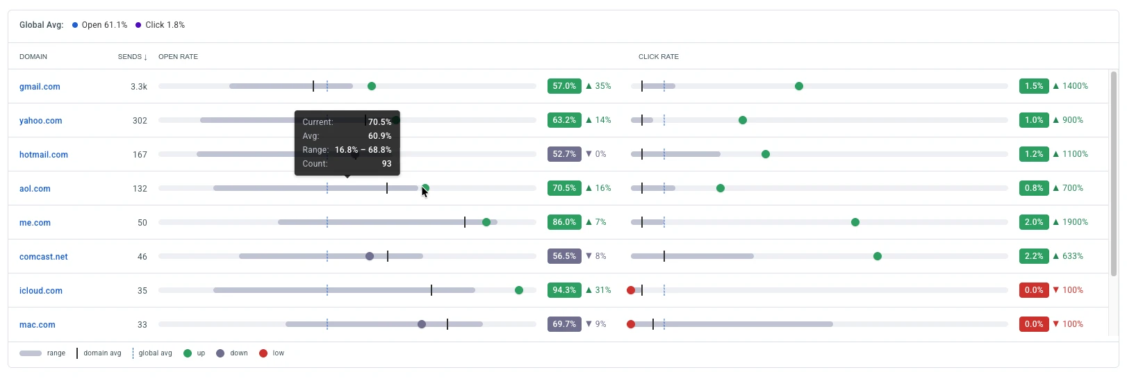
The strip chart shows how each recipient domain is performing for the current broadcast compared to that domain's historical engagement. Each row represents a single domain and displays the domain name, total sends, and two horizontal performance tracks -- one for Open Rate and one for Click Rate.
Each track uses the following visual indicators:
-
Grey bar: The domain's historical performance range (min to max) across past broadcasts
-
Dark vertical tick: The domain's historical average (its normal baseline)
-
Blue dashed line: The global average for the current broadcast across all domains
-
Colored bubble: The current broadcast's rate for that domain:
-
Green: Current rate is above the domain's historical average
-
Grey: Current rate is below the domain's historical average
-
Red: Current rate is significantly below historical average (less than half)
-
Hovering over any track displays a tooltip with the current rate, historical average, min/max range, and the unique open or click count behind the percentage.
Opens
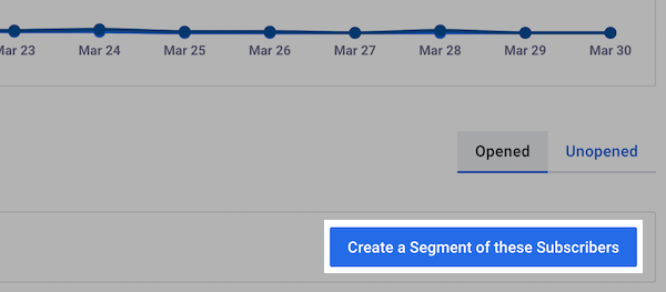
The Opens tab displays engagement data for subscribers who opened your message.A line graph plots Total Opens vs. Unique Opens over a two-week period, giving you a visual breakdown of open activity over time. You can adjust the time range using the dropdown in the upper right of the graph.
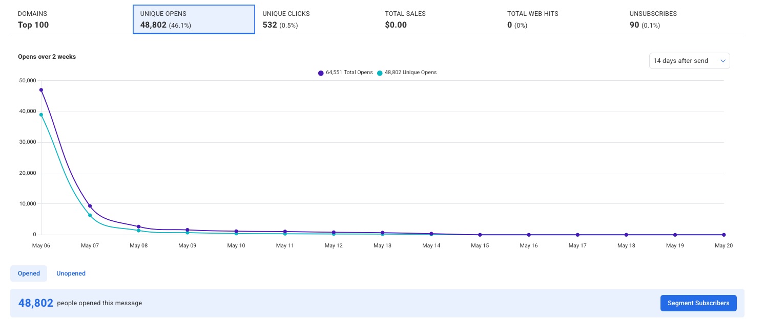
Below the graph, a table is divided into two sub-tabs: Opened and Unopened. The Opened table lists each subscriber who opened the message, along with their email address, name, Total Opens, Total Clicks, and Sales. From here, you can click ‘Segment Subscribers’ to create a segment based on this audience.
Clicks
The Clicks tab displays engagement data for subscribers who clicked a link in your message. A line graph plots Total Clicks vs. Unique Clicks over a two-week period, giving you a visual breakdown of click activity over time. You can adjust the time range using the dropdown in the upper right of the graph.
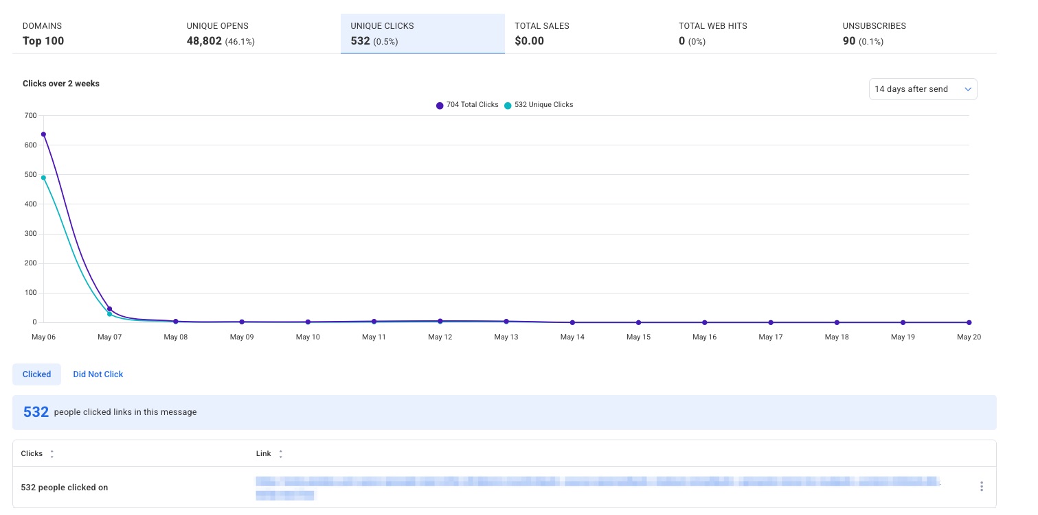
Below the graph, a table is divided into two sub-tabs: Clicked and Did Not Click. The Clicked table lists each link that was clicked, along with the number of clicks and the full link URL.
Sales
The Sales tab displays data for subscribers who made a purchase after clicking through this message. Setting up sales tracking is required to see sales data. A line graph plots Total Sales over a 24-hour period, giving you a visual breakdown of sales activity over time. You can adjust the time range using the dropdown in the upper right of the graph.
Below the graph, a table is divided into two sub-tabs: Sales and No Sales. The Sales table lists each subscriber who made a purchase, along with their email address, name, Total Opens, Total Clicks, and Sales amount.
Web Hits
The Web Hits tab displays data for subscribers who visited your website after clicking through this message. Installing web analytics is required to track web hits. A line graph plots Total Web Hits over a 24-hour period, giving you a visual breakdown of web visit activity over time. You can adjust the time range using the dropdown in the upper right of the graph.
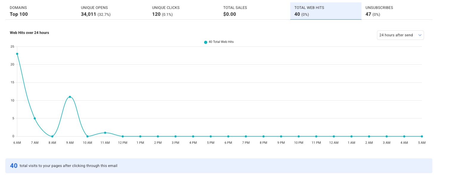
Below the graph, a table lists each page that was visited, along with the number of visitors and the full page URL.
Unsubscribes
The Unsubscribes tab displays data for subscribers who unsubscribed via this message. A line graph plots Unsubscribes over a two-week period, giving you a visual breakdown of unsubscribe activity over time. You can adjust the time range using the dropdown in the upper right of the graph.
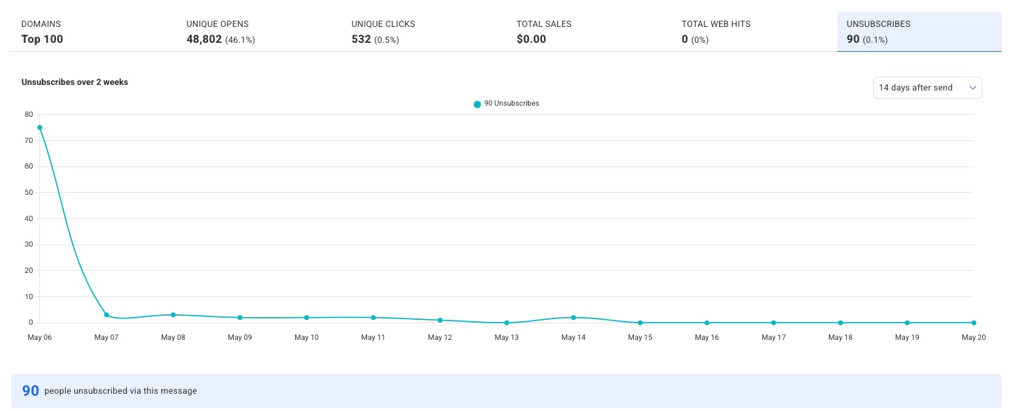
Below the graph, a table lists each subscriber who unsubscribed, along with their email address, name, and status.
Segmenting
One way to utilize this information is to create segments, allowing you to send broadcasts to specific groups of subscribers based on your stats. Under the performance graph, you'll have the option to quickly save a segment based on the data you're viewing.
With your newly saved segment, you can send your next broadcast to the targeted group of subscribers.
Automations
If you set up any automations, they will display under the Automations section. Automations based on opens and link clicks along with the corresponding tags for each will be shown.

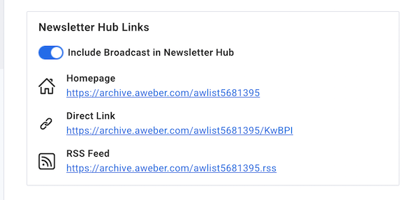
Newsletter Hub Links
If you want to change whether or not your message is posted to your Newsletter Hub, you can do so by clicking the toggle for "Include Broadcast in Newsletter Hub" under the Newsletter Hub Links section of the page.
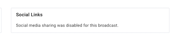
Social Links
Under the Social Links section, you will see the Social Media pages you've shared the broadcast on. This information would be the Facebook page and/or Twitter page you've shared the broadcast to. If neither social media page was selected at the time of the broadcast sending, no pages will be displayed.
Wrapping Up
At the bottom of the page are the last three buttons. To view the message you sent, click "Review Message." To make a copy of the message, click "Copy to Drafts." You are also provided the option to export the broadcast's data. Click the "Download to Excel" button to process this.
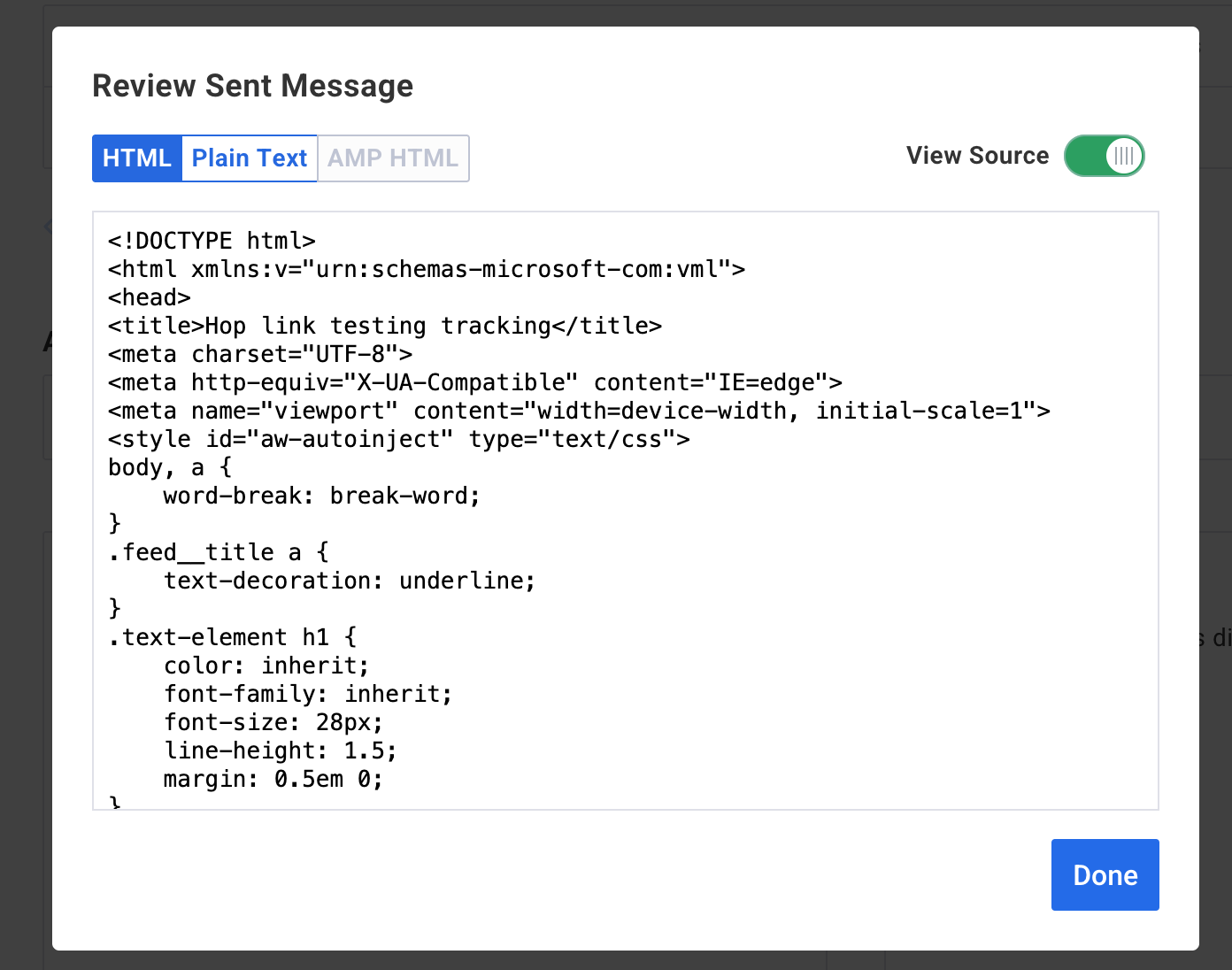
After clicking the "Review Message" button, you are presented with the HTML version and Plain Text version of your sent Broadcast. If you wish to view the HTML source code of the sent message, click the option to "View Source" for the sent code to be displayed. The "View Source" button can be toggled on and off to switch from the HTML sent version of the broadcast to the actual HTML code of the sent broadcast.